Notes Of: Tomatoes
Behind the mood board
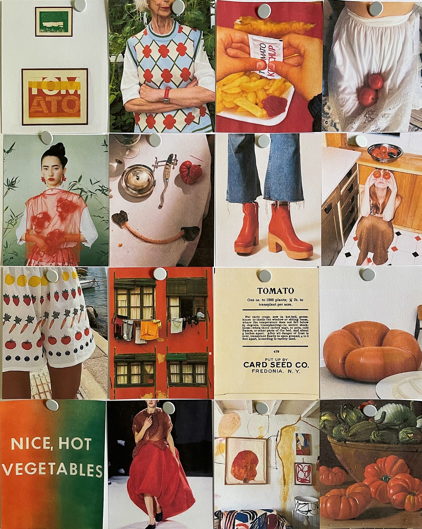
Welcome to the very first Notes Of, a new column on ÀLC! Each month I make a mood board and post it to Instagram as a little exercise in thematic thinking. Notes Of will elaborate on each month’s theme and will include links to relevant articles, videos, products, and more. It’ll be fun!
This month’s mood board was inspired by the fruit of the season, the tomato. Once one of my least favorite foods for both texture and taste reasons, a ripe tomato is now something I look forward to all year (preferably on a bread of some sort and always seasoned.) And what better time to explore its properties and overall ~vibe~ than during Tomato Girl Summer!?
Everyone makes and uses mood boards in their own way, and even I make various types of boards for different purposes, so know that there is no right way to do this. Most often I’m using a selection of images to communicate an overall feeling to a client, so when they step back and look at it they get a sense of a project’s tone. These normally aren’t very literal — the images play off of each other to communicate a more abstract idea (ie. “the feeling of a Mediterranean summer” or “constant movement and energy”.)
When I am trying to describe something more pointed (maybe like, “Italian food packaging from the 1960s” or “a Mexico City-inspired color palette”) I’ll make what I call a theme board, which is a collection of images that are examples of that idea. I use theme boards to guide my research, visualize a next step, or break down a bigger concept.
Sometimes, especially when I’m busy and don’t have a lot of time to think, I find myself in a place where I’ve only picked the low-hanging fruit of an idea. For example, say I want to develop a floral pattern for a client to use across their brand materials. I’ll start by going onto Pinterest and typing “floral print”, click on one I like, scroll down to the additional images the algorithm suggests are relevant, click on one of those, and so on. I could pull 20 examples of florals pretty quickly that do the job and I’ll end up with a nice looking selection of images. But those 20 images will just be of other people’s floral prints, and I won’t know who painted most of them, where or when they were made, or if they carry any significance or meaning. Devoid of context, I’m just looking at other people’s interpretations of an idea.
BUT, say I started by typing “floral print” into Pinterest and I came across something interesting and clicked through to the source. I might end up taking a look at that artist’s other works and learning about their life and contemporaries or scrolling through the museum archive that the initial image came from. I might remember when I was in a vintage store and saw a chair upholstered in beautiful floral fabric. I might find myself reading about the significance of certain roses, how they were named and who for. It all makes for a richer perspective for when I go to create or commission my own floral pattern and to weave a narrative into what I’m making, connecting it to the bigger picture behind the brand.
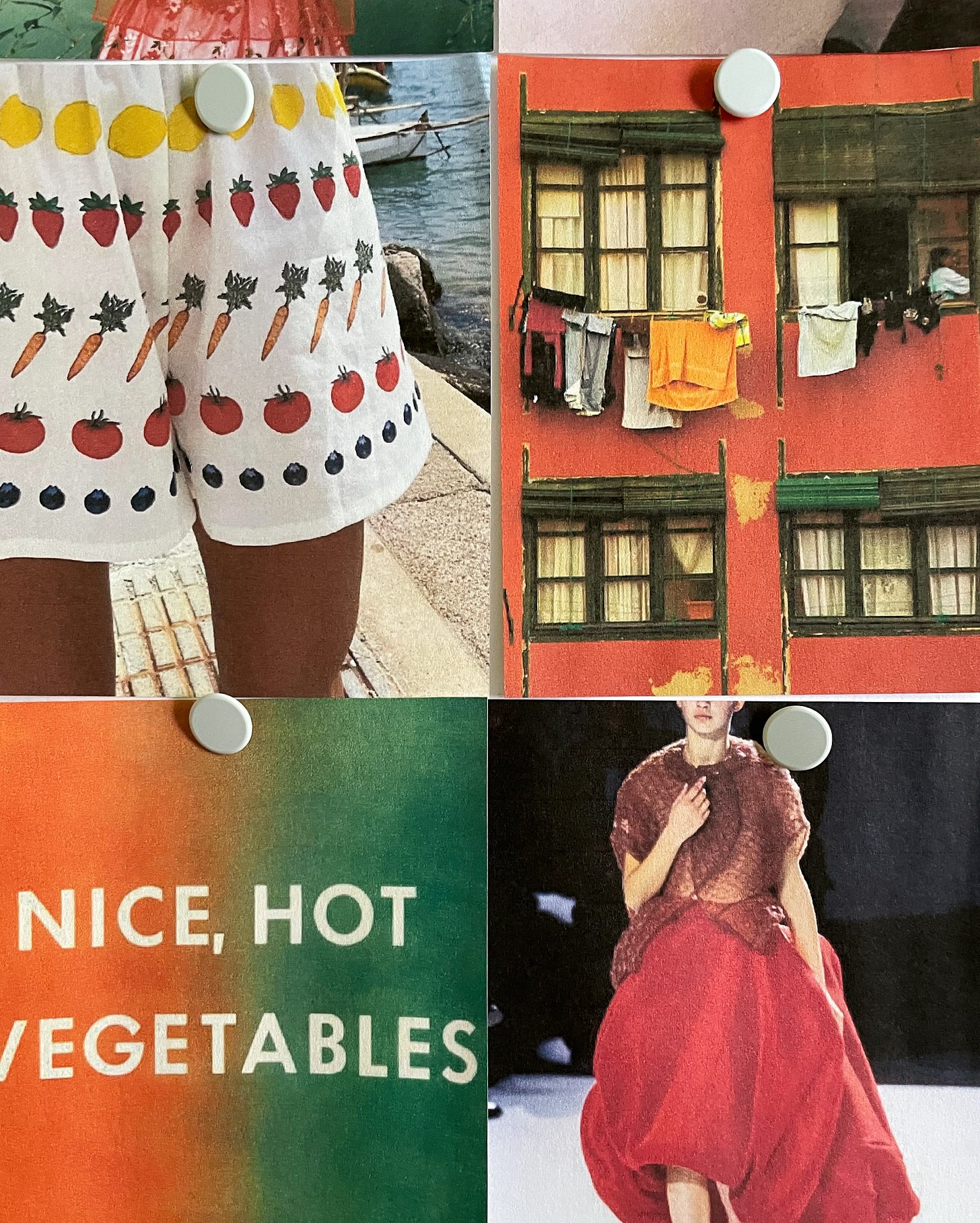
It takes a ton of practice, though, because there is SO MUCH (pre-curated) STUFF out there to consume. I started doing these little exercises for the purpose of training myself to take a step further and to think about a theme from different angles. With tomatoes, for instance, I considered a few things: their shape, their color, their translucent insides, their texture, their taste, and their many forms (juice! sauce! ketchup!) I knew that Rei Kawakubo had designed some round, architectural pieces for Comme Des Garçons in the ‘90s, so I looked through runway shots for something that might structurally resemble a tomato. I remembered that I had some boots saved to my wishlist from Charlotte Stone made in this sort of half-glossy, tomato red leather. I thought about the proportion of color on a classic tomato: mostly red with a little bit of green. It’s a balance between being too abstract that it no longer is about a tomato at all and too on-the-nose, where it’s just a bunch of photos and drawings of tomatoes. I continue to images and swap them out until I find 16 that feel right across a bunch of mediums and contexts.
Phew, that was a lot! Is this boring? I felt like I needed to get that out there so that we could get into the fun stuff. Without further ado…
10 notes on tomatoes:
Hello Adrianne (named the queen of the Tomato Girl Summer by the NY Post) made a Tomato Air Freshener! For $10 your car can smell like a garden.
Malcolm Gladwell’s 2004 examination of why there are so many different types of mustard but only one type of ketchup, titled The Ketchup Conundrum for the New Yorker. It sounds so boring and dumb but it was very entertaining (and educational!) to read.
I love making Alice Waters’ tomato confit, my favorite of all the confit recipes (and the simplest.) I serve mine with pasta (duh) but it’s also so good on ricotta toast!
This piece on the Hammer Museum website about Sister Corita Kent’s the juicest tomato of them all, which is pictured in the mood board above in the top left corner, and its representation of the Virgin Mary. (lol)
If you, like me, really really want the Loewe Tomato Leaves candle but don’t want to spend $110 on it, here are some alternatives. I can’t speak to the dupe-factor of all of these but I will say that I like the Flamingo Estate Roma Heirloom Tomato candle and I was just recommended the Carrière Frères Tomato candle, which I think I might buy myself. I do not endorse the Trader Joe’s version.
Former At The Table With guest Ana Inciardi’s story about how she discovered the existence of the Inciardi Paste Tomato, a variety brought from Sicily to Ellis Island by her relative Enrico Inciardi in 1898. It’s really sweet to read!
Nancy Meyers’ ode to Ina Garten and her sun dried tomato dip for Bon Appétit is all so perfectly ‘90s coastal in every way.
These ceramic tomato candleholders by artist Diego Nine, shared with me by another former At The Table With guest, Kelsey Rose Williams! I am obsessed with them and if anyone wants to buy me a gift, by all means.
A recommendation for Donna’s in Echo Park, a new red sauce joint with very, very, very good fusilli alla vodka.
I have yet to make a purchase but I’ve been keeping an eye on At The Moment, a made-to-order t-shirt company whose graphics I really like. Their business model is interesting — you can read about it here — but back to tomatoes! They have several tomato designs, but this one’s my favorite.
What do we think? Do we like Notes Of? Are mood boards interesting? How are we eating our tomatoes? Sound off in the comments.
Enjoy your Sunday!
x
Ali
Mood board sources (from left to right):
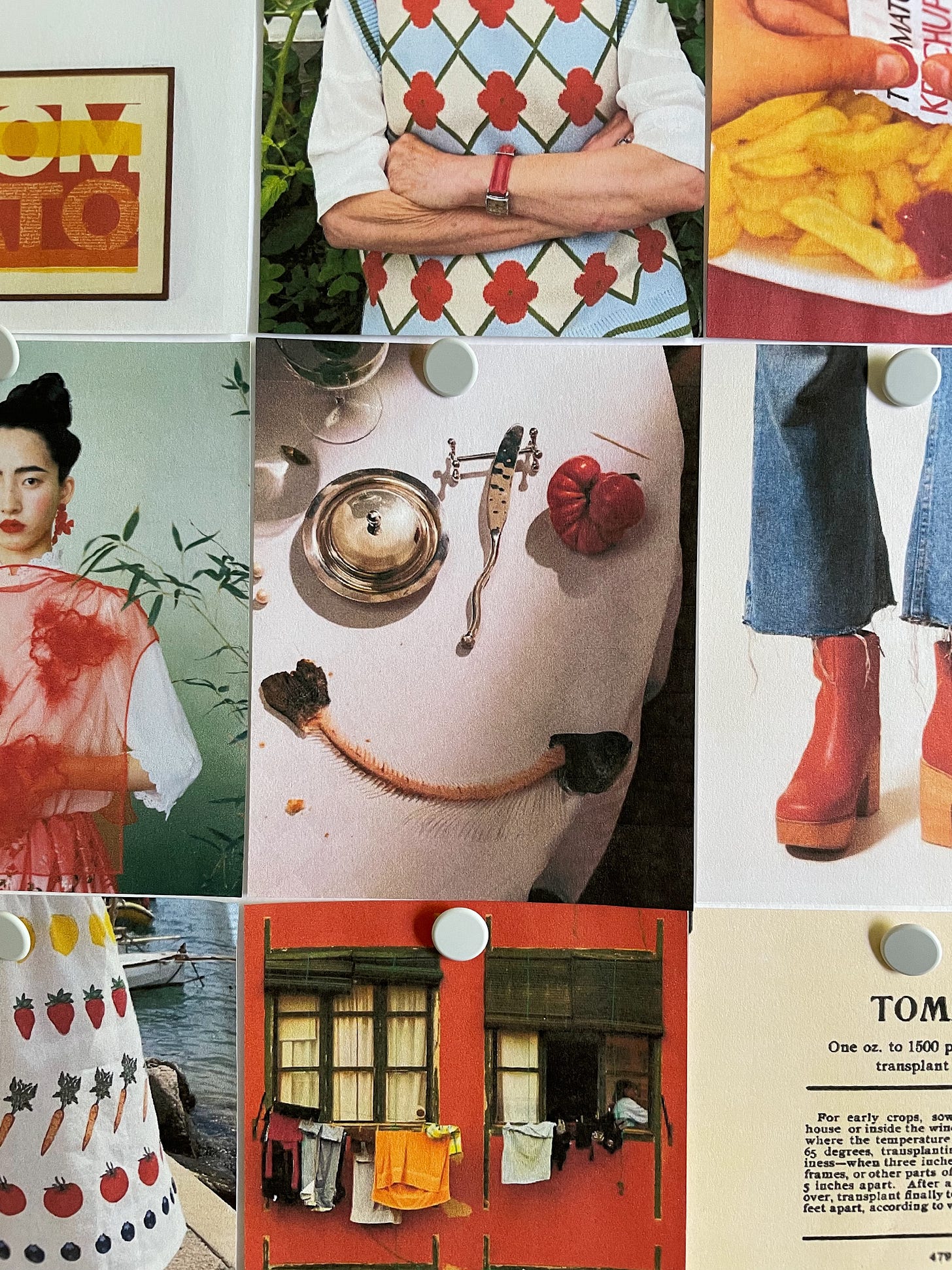
“the juiciest tomato of all” by Sister Corita Kent, 1964; Lady Henrietta Rous in Chateau Orlando; unnamed ketchup photo by Martin Parr; tomatoes in a skirt by Lucia Zolea; portrait by Leslie Zhang; tomato face by art director Stephanie Stamatis and photographer Lauren Bamford; Paz Clog by Charlotte Stone Shoes; tomato eyes by Lukasz Wierbowski; shots by Yellow the Label; red building by Esparkling on Flickr; vintage tomato seed packet from Card Seed Co. of Fredonia, NY; tomato chair by Christian Adam for Espace Pierre Cardin, 1972; “Nice Hot Vegetables” by Ed Ruscha, 1976; red skirt from Comme des Garçons Spring 1997; interior image and painting by Heather Chontos; “Still Life With Tomatoes, A Bowl of Aubergines, and Onions” by Luis Meléndez, circa 1771


As more of a text person who would like to become more visual, I’m into the mood board! In fact, I’d love to get more in the weeds. What software do you use to create these mood boards? There is someone on IG that makes mood boards based on novels she’s read, and I think that might be a lovely way to go deeper into the books I love. TY!
I absolutely love this series, and this particular edition. Thanks for sharing your creative process. Off to make my own moodboard. :)