Room Recipe: A Brick Red Kitchen in New York City
A step-by-step guide to translating inspiration into real life
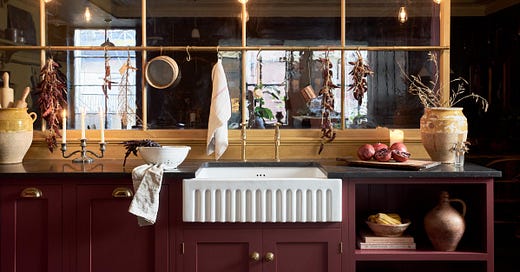
Welcome back to Room Recipe, a new column on À La Carte where we stare at an image of a room we love for a very long time, then break down its “ingredients” into specific items and themes. The goal is never to copy, but instead to get to the bottom of why certain rooms just *work* and to understand how we can translate that inspiration into real life. So far I’ve recipe tested Eliza Harris’ wood-paneled living room in Connecticut, Lucy Williams’ Scandinavian-inspired dining room in London, and Pia Baroncini’s kids’ bathroom in Pasadena. This month, we’re tackling kitchens. Specifically, this kitchen:
Of all the rooms, I think kitchens are the hardest to draw inspiration from (unless you’re doing a full remodel, which is not what this column is about.) They’re made up of so many inflexible components that you can’t easily swap out, like dishwashers and cabinetry and refrigerators, so I think they tend to go neglected until there’s a budget for a big change.
But I do think there’s something to working with what you’ve got. I’m not typically one for a hack (i.e. contact paper on countertops or peel-and-stick tiles as a backsplash,) but sometimes a fresh coat of paint or swapping out a faucet can make a big impact. I’m a renter (I’m sure many of you are too) and while ripping up my flooring or changing the layout of my kitchen is not in the cards for me, I still look to my favorite designers for inspiration when it comes to things like storage and styling.
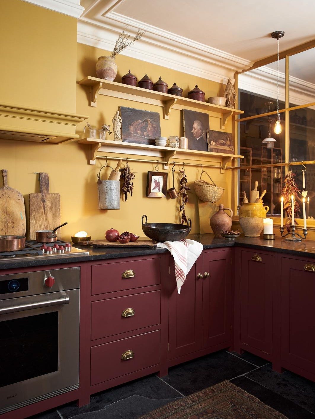
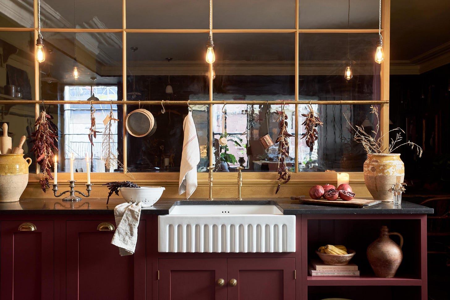
One of those favorite designers is deVOL Kitchens, a design studio based in the UK that you might recognize from their TV show, For the Love of Kitchens. deVOL is known for their very English aesthetic: traditional cabinetry, farmhouse-y styling, and a very “it’s been this way forever” feeling. I stopped into their showroom when I was in New York last month and fell in love with one of their setups: a gold and dark red kitchen with open shelving, dark countertops, and lots of rustic details. It’s not a color combo I’d typically gravitate towards, but standing in that room just felt so warm and homey, like it’d be the ideal place to make a huge pot of soup. I think what was especially interesting to me, though, was how the accessories in the space—the storage solutions, the cooking tools, and the decorative items—were doing a lot of heavy lifting in making it feel that way.
So, in preparation for all of the stews and cornbread muffins and apple pies ahead, I’ve broken the design of this kitchen down into a lengthy, three-part recipe to inspire an autumnal refresh. (No gut reno required!)
Keep reading with a 7-day free trial
Subscribe to À La Carte to keep reading this post and get 7 days of free access to the full post archives.


