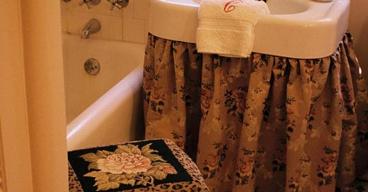
Room Recipe: A Dreamy Bathroom Filled with Antiques
A step-by-step guide to translating inspiration into real life
Welcome back to Room Recipe, a new column on À La Carte where we stare at an image of a room we love for a very long time, then break down its “ingredients” into specific items and themes. The goal is never to copy, but instead to get to the bottom of why certain rooms just *work* and to understand how we can translate that inspiration into real life. So far I’ve recipe tested Eliza Harris’ wood-paneled living room in Salisbury, Connecticut and Lucy Williams’ Scandinavian-inspired dining room in London. This month, I’m tackling Pia Baroncini’s daughter’s bathroom in Los Angeles.
Yes, a kids’ bathroom.
Is this not the chicest kids’ bath you’ve ever seen? It looks like it could be in an Italian bed and breakfast where espresso is delivered to you on a silver tray each morning. I’ve only caught glimpses of Baroncini’s Pasadena house on her Instagram—her son’s nursery is a work of art, and the peeks you get of the property in this Doen feature are stunning—but from what I’ve seen it might be my dream house.
Truthfully, I don’t pay a ton of attention to kid-related design content, but I love how this bathroom feels both young and sweet and also like it’s for adults. I totally get that stuff for kids can be unavoidably unpleasant to look at, and I’m sure Peppa Pig bath toys (or whatever children like these days) are just out of frame, but I really appreciate when people make design decisions that their kids can grow into. The house is full of history (it’s Pia’s childhood home) and gorgeous antiques (her husband Davide is an Italian fashion designer and has really good taste,) so this bathroom just feels like an extension of the feeling present throughout the rest of the house.
Bathrooms are tricky in general. Unless you’re doing a full remodel, you’re often stuck with the decisions of people who have lived in your home before you… I get grossed out if I think about it too hard. A lot of the older homes and apartments in LA either have very old tile (sometimes beautiful, sometimes hideous) or the landlord special, so minor cosmetic updates can feel a little like putting lipstick on a pig. (Peppa, perhaps.) My last apartment had a bathroom I described as “Las Vegas Venetian,” AKA fake travertine from floor to ceiling, so I can commiserate. But no matter the situation, I do believe there are some updates you can make before you give up completely.
Let’s break it down.
PART 1: COLOR + LIGHT
Have you ever been in a bathroom with really bright white light, the kind that makes you feel like you’re in a freezing cold doctor’s office? This is the opposite of that. It’s a warm and glowy palette of pinks, browns, black, and cream that makes the room feel cozy and soft. I imagine the fluffiest white robe is hanging on the back of the door and, when the windows are open, you catch a whiff of the jasmine or orange blossoms blooming outside. I think that feeling exists in large part thanks to Farrow & Ball’s Pink Ground, which is what’s painted on the walls.
Not all of us can paint our bathrooms—mine is best left white—but we can bring in some color through other ways that get us closer to this vibe.
What to look for:
Warm pinks bordering on clay brown or terracotta orange.
Soft, warm light bulbs. If you’re someone who is worried about applying your makeup in a particular light I recommend getting one of those light-up makeup mirrors rather than lighting the entire room for it.
Brown and black accents. I think the inclination is to paint things white for kids' rooms, but having that contrast keeps this room from feeling too cutesy.
What to avoid:
Pinks that read too little girl, like baby pink. Farrow & Ball is famously good at pinks, but no matter what paint brand you’re using, it’s imperative that you swatch test. I speak from personal experience—pink can look gray, orange, brown, purple, or blue depending on any number of variables, so you’ll want to make sure you’re choosing something that looks good at all hours of the day, sunny or cloudy, lights on or lights off.
For example:
Let’s start with lighting. I don’t have a specific rec for light bulbs (I’m sure someone in the comments will have one!) but I do have plenty of suggestions for window dressings that can beautifully diffuse natural light, giving the room a soft, pretty glow. Baroncini used a sort of gingham-y, sheer fabric for hers, like these below, which you can order in custom sizes:
But any gauzy fabric would do—a cotton lace, a stripe, or even vintage tea towels would work great. (I made a curtain out of French tea towels for my front door and it took all of one hour.)
Maybe you aren’t painting and your only opportunity to get some pink into the room is via your curtains (shower or window) or your towels. Something simple like this in that perfect pink-but-a-little-brown shade could have the same effect:
Even cream with a pink undertone would be a good choice.
PART 2: ANTIQUES
Antiques get their own category because the little vintage accents in this room—the gilded mirror, the upholstered stool, and the ornate wall sconce—are really the stars of the show. There’s also a piece of wooden furniture just peeking into the frame that I’m assuming is some sort of console or cabinet for storage. Pia’s husband Davide founded Ghiaia Cashmere, and his shop in San Marino is filled with the types of pieces I’m imagining here.
What to look for:
Things you wouldn’t normally associate with a bathroom. I wouldn’t necessarily think of putting a little upholstered vanity stool next to a bathtub, but it works here.
Dark wood. It’s just the vibe we’re after.
Timeworn brass. Baroncini posted on Instagram that she’s looking for antique brass hardware to match the mirror and light fixture she’s used here.
What to avoid:
Brass that looks perfectly shiny or new. You want it to feel like it’s lived several lives before it’s made its way to your bathroom.
Parents and practical people are going to hate me for this one: plastic, or anything that’s, like, specifically made for a bathroom. I am acknowledging that not everyone can sacrifice function for form but this is just how this recipe goes!
For example:
Let’s start with a mirror—every bathroom has one. If you too want yours to contribute to the “this house has been in my family for centuries” aesthetic, might I suggest one of these?
A tiny gold mirror would be cute, too. Not as your main mirror, but, like, as a cute little accent piece…
I also found this wall sconce for a candle that would be cool. I’m not recommending this as a primary light source for several important safety reasons, but imagine taking a bath with a Santa Maria Novella pillar candle propped on this guy:
Even something small, like a soap dish or a toilet paper holder, could be a good opportunity for an ornate brass moment. There’s a ton of stuff like this on Etsy—just search “antique brass bathroom.”
Onto furniture. Obviously there are things to consider here, like space, storage, and proximity to water, but bringing some dark wood into a heavily tiled room really does warm it all up. To start, some little upholstered stools (some of which need an upholstery refresh):
As for larger pieces of furniture, these could be perfect for storing towels or your huge collection of beautifully packaged bar soaps. I can already hear the practical amongst you saying “But steam is bad for wood!” or “That’s not meant for a bathroom!”, so I’d like to remind you that a sense of adventure here is what’s necessary for that perfect “This has been here forever” feeling.
PART 3: TEXTILES
Imagine if this room didn’t have the little hit of leopard print on the stool, or if the sink wasn’t wearing a skirt! Those little hits of pattern and texture are key players in this bathroom. Both textiles are sort of kooky-grandma-meets-French-cottage, and somehow they work well together. As Shakespeare once wrote, the clothes maketh the… bathroom fixtures.
What to look for:
Vintage fabrics, or vintage-inspired fabrics. Florals, stripes, cross-stitching, embroidery… It’s all fair game, as long as it doesn’t look too graphic or modern.
Crossover between color palettes. What makes two sort of wacky patterns play well together is a shared color palette (like the brownish-tan base of the skirt and stool.)
What to avoid:
This is a hard one, but there’s such thing as too much grandma. In small doses fussy florals and animal print can work, but it takes skill to be able to balance something that borders on kitschy with something that feels elevated. Just be sensitive to it.
For example:
Let’s focus on things that are already made (versus by-the-yard fabrics) because there are a billion trillion fabrics in the world. To start, we have shower curtains of the floral variety. (Hot tip: I always buy two shower curtains and part them down the middle—it just looks better compositionally in the room. Like this! Or this!)
You could also bring some florals in by way of a little hand towel, like this one:
Now, I’ve been avoiding the leopard component of this because I think the stool in our reference image is the perfect amount of leopard print, and any more would take this room into an entirely different direction. Like, imagine leopard print towels here. It just isn’t the same.
So maybe leopard print comes in the form of something you can frame, like this antique needlepoint canvas:
Or maybe it’s by way of this pair of ottomans:
Whatever it may be, it’s going to be one of those things you randomly stumble upon at a yard sale or flea market, so just keep your eyes open. (Or have your friend who took up needlepoint in the pandemic make you a little something.)
PART 4: THE EXTRAS
Like I said last time, the extras aren’t really ingredients—they’re more like a salty seasoning or demerara sugar or whatever else you use to finish off a dish. Baronicini’s extras include monogrammed hand towels, fancy hand soap, and a tissue box cover that is hiding what is surely an ugly cardboard box of Kleenex.
And there you have it! The classiest, most beautiful bathroom for kids and their parents that transports you to the Tuscan countryside. I’m always taking submissions for Room Recipe, so let me know what room you want me to dissect next!
x
Ali
In case you missed it:
The two shower curtain trick is blowing my mind.... makes a bathtub look like an opulent velvet-curtained theater stage! I have a glass shower door but will for sure be using this tip in my next apartment
I LOVE THIS SERIES! So great for taking baby steps into the space styling world.