

Book Notes, Part Two: The Fun Part!!!
Behind-the-scenes of writing and designing my first book

Back in March, I shared an update on where I was in the process of writing my book, what it’s about, how I got here, and some of the deep, dark fears that were keeping me up at night along the way. I’m famously and embarrassingly terrible at coping with the feelings that come with doing something for the very first time, and writing a whole manuscript definitely challenged the part of me that wants to effortlessly “ta-da!” everything I do.

But I’m back, baby! I turned in my manuscript in early May and a second draft last week, and now I’m in the phase I’ve been looking forward to most: prepping for the photoshoot in August, designing the book, and obsessing over every little detail that will go into making this thing beautiful. I know how to do this, and that makes this phase feel empowering and all-consuming (in a good way!), even if the client (me) is the toughest I’ve booked yet.
So, for this second update, I’m giving you a glimpse into the visual planning process for the book: the people, places, and things that have influenced the color palette, typography, art direction, and general atmosphere. I’m eager to look back at this once I’m on the other side to see how much of it ultimately shows up in the final pages—I think some of the best ideas come midway through making something, and you really can’t plan for those, you just have to be ready to accept them. And while I can’t show you anything too specific (Claire, if you’re reading this, don’t worry!!!), I’m excited for those of you who have been with me since the beginning to see it all reflected in the finished product.
Let’s open up the inspiration folder.

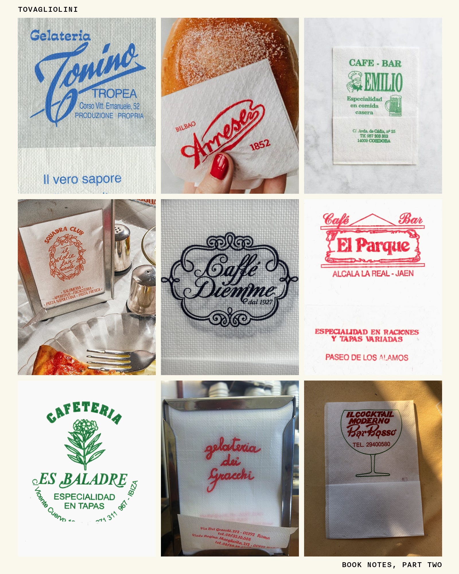
Tovagliolini. Those little printed, non-absorbant napkins you see at cafés across Europe with the cute branding aren’t actually napkins—they’re more of a means of sanitation, so when you eat your croissant or your slice of pizza, you can do so without touching it directly with your hands. The type from the book is all inspired by ephemeral graphics—napkins, matchbooks, pastry bags, and bits of packaging—and more than one tovagliolino has made it into my mood boards.
The next three months are entirely focused on making it all happen. I’ll spend the weeks leading up to the shoot in August writing an art direction deck (it’s currently 29 pages…), working with my photographer (a secret for now!), sourcing props (I can’t help myself), and collaborating with Maddy on design along the way.
By the time I send the next one of these, I’ll have turned in my galleys—the entirety of the book’s interior!—and I’ll be starting to work on the cover. Drop any questions you have in the comments—I’d love to answer them.
x
Ali
If you enjoy reading À La Carte (thank you!!!) and want to show your support for my work:
Throw a like or comment on this post
Share this post with someone who might be into it
Follow me on Rec League (and download the app—it’s way more fun!)
And if you’d like to partner on an issue of À La Carte, shoot an email over to hello@alilabelle.co!

The Museum of Joanna Goddard

Welcome back to The Museum, a new-ish column on À La Carte that hands us a map to a gallery of the objects, ideas, and references that make up a person’s life, from the entrance hall to the gift shop. My next guest is someone whose visual world many of us have been peeking into for a while now: Joanna Goddard!
Art Deco Du Jour

“I hate Art Deco,” I overheard a woman admit to her shopping buddy in a vintage furniture store a few weeks ago. “It’s so masculine. I prefer Art Nouveau.” (Italics added for dramatic effect.) I quickly darted my eyes in her direction to peek at what piece of furniture could have prompted this bad take, but ultimately, I couldn’t tell—she was standing near a Brutalist coffee table and some midcentury Danish chairs.
i move to put tovagliolinis by all gas pumps and door handles
I feel like I’m expecting my first grandchild. Can’t wait! 💐🤗💕